Stuck on stupid: Jaguar takes a drive off Bud Light cliff
Some things I can't understand.
Such as how a storied old company with a golden brand name could desecrate its image through a new campaign "proving" that it's woke and out of touch with the public?
Take a look at Jaguar's new image, beginning with an opening ad:
The got rid of the big cat, though it seems to survive on a logo square full of T.V.-on-the-fritz lines in one incarnation. They created a noodly-looking round logo reminiscent of Tori Burch designer wear, circa 2004. They scrapped their beautiful "wordmark" or company name written in distinctive fonts, and created one straight from from the 1970s groove scene.
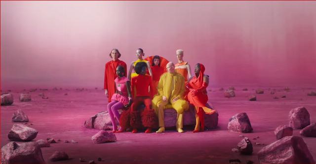
Worse still, they put out a car-free ad full of youthful wokesters wearing colored trashbag fashion seen on Paris runways these days. It doesn't look anything like the old classic Jaguar image which was of speed and luxury, with guys in Cary Grant suits. Where are the cars?
This in fact looks more like the Last Supper scene from the Paris Olympics -- men wearing women's clothes, fluorescent colors of the kind seen in gay discos. Take at look at this guy out front in yellow from the video -- clown pants all puffy at the hips just like you see on Ronald McDonald. The only thing that's missing are the big red shoes:
According trade journal Creative Bloq:
Car rebrands are always big news in design circles, particularly when they involve brand new logos. So when Jaguar yesterday debuted not one, but three new designs, comprising a wordmark, monogram and tweaked version of its famous leaping animal, it certainly made a splash. And, as you might expect, the reactions have been strong with this one.
With a minimal wordmark featuring a mixture of upper and lowercase letters, and cyperpunk-esque marketing imagery, this isn't what people expected from the luxury sports car brand. While others are opting for a heritage look, Jaguar is leaning into 'modern'. And it's proving too much for many, with commentators across the whole of social media sharing their thoughts – including Elon Musk.
The site recommended a gander at the car's enthusiasts' page on Reddit, where we learned the new logo was not going over well.
"Stupid, stupid, stupid" said one. "Still looks like macaroni to me," said another. "So a high end massage parlor font, great job," said yet another. "A logo for a company doing furniture or kitchens," another opined. "Feels like it belongs in some kind of fast food joint." ... "It looks like something you'd find on yogurt container."
Suffice to say, not many liked it.
Elon Musk, who owns Tesla, asked them if they still sold cars.
They seem to be selling just image now, pay no attention to the car, or the value of the car, which as Jaguar owners from my old Beverly Hills neighborhood have told me, is frequently in the shop.
Nor is it the image they claim it is, which is original, given the 1970s association of the font style and the woke hipsters featured in the ad. The character throwing a hammer around in his women's clothing is clearly a copy of the Apple ad about challenging the dominant paradigm. Even Hillary Clinton borrowed from that, way back in 2016. Been there, done that.
We've all seen it before, yet these idiots keep pushing it, calling it 'original,' and as Jaguar says: "copy nothing."
Actually, they copy a lot, and what they copy has been resolutely rejected by the public.
Jaguar is defiant, though, biting back instead of listening to its customers, as the Daily Mail reports:
British carmaker Jaguar has hit back at critics of their rebrand after they released an advert without any cars in it.
The manufacturer unveiled a new logo on Tuesday as part of their rebrand, as well as a cryptic and colorful advert.
Posting the video to their social media site, the ad shows a group of models dressed in bright and flamboyant clothing.
The ad occasionally pops up with text reading 'create exuberant', 'live vivid', 'delete ordinary', 'break moulds' and 'copy nothing'.
As it does so, the characters can be seen grabbing at sledgehammers, painting over the screen and posing for photographs in sync.
And it's as lemmings-like as can be, going the way of other troubled classic brands that have tried to get all fashionable and hip, to generally bad reviews. I certainly stopped being a Burberry customer when they started trying to appeal to the trans and Diddy crowd in their imagery -- the clothes looked chaotic and artificial and the quality went downhill. Same with Brooks Brothers, which is now crawling out of bankruptcy for it, though they didn't damage their brand as badly as some of them -- Abercrombie & Fitch springs to mind, which went the pervert route as if they were trying to appeal to that crowd.
Now Jaguar is letting itself go to heck on the brand name, and never got the memo about what happened to Bud Light when it went hip, trans, and Hollywood.
In some ways it's fitting though. The ugly mess is reported to be the work of 800 people, which sounds like rule by committee, and with similar result. What's more, the new logo suggests the British upper class no longer believes in itself -- it hates itself, actually. This ad is pretty expressive of self hate. So now we get this. Let's see how well this goes for them.
Image: Screen shot from Jaguar video, via YouTube


